


Choosing paint color is one of the most impactful and affordable ways to change how a room feels. The right color can make a space feel larger, calmer, warmer, or more energetic. The wrong one can make it feel dark, closed-in, or uncomfortable. Many people feel overwhelmed by the thousands of options available, but a clear process makes the decision much easier.
Here are practical tips for selecting the right paint color for any room.
1. Start with the purpose of the room
Different rooms need different moods.
- Bedrooms usually benefit from calm, restful colors such as soft blues, gentle greens, warm grays, or muted neutrals.
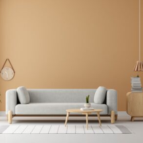
- Living rooms often work well with welcoming neutrals, soft warm tones, or light earthy shades that feel comfortable for gathering.
- Kitchens and dining areas can handle slightly brighter or warmer colors that feel clean and inviting.
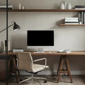
- Home offices do better with colors that support focus, such as soft neutrals, muted greens, or light blues.
- Bathrooms often look fresh with light, clean tones or soft cool colors.
Matching the color to how the room is used creates a space that feels right for its function.
2. Study the natural light in the room
Light changes how color appears.
- North-facing rooms receive cooler, weaker light and often look better with warmer paint colors to balance the coolness.
- South-facing rooms get strong, warm light and can handle cooler or deeper colors without feeling dark.
- East-facing rooms are bright in the morning, and softer later, so medium tones usually work well.
- West-facing rooms receive warm afternoon light, so cooler neutrals can prevent the space from feeling too yellow or orange.
Always observe the room at different times of day before deciding.
3. Test paint samples properly
Never choose a color from a small paper chip alone. Paint large samples (at least A4 size or bigger) directly on the walls in different areas of the room. Look at them in morning light, afternoon light, and artificial light. Live with the samples for two or three days. Colors that look perfect in the store can appear completely different at home.
4. Consider existing elements in the room
Paint does not exist in isolation. Take into account:
- Flooring color and material
- Furniture and large rugs
- Countertops or cabinetry
- Curtains and fixed finishes
The paint should harmonize with these fixed elements rather than fight them. Bring home fabric swatches or photos of furniture when selecting colors so everything works together.
5. Understand undertones
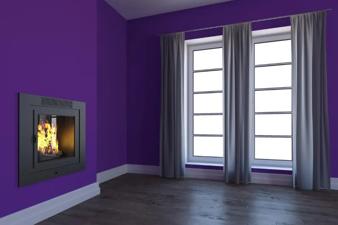
Most paint colors have undertones, such as subtle hints of other colors. A gray may lean blue, green, or purple. A beige may lean pink, yellow, or green. These undertones become more noticeable once the paint is on the wall. Testing samples next to furniture and flooring helps reveal whether the undertone clashes or complements the rest of the room.
6. Use the size of the room as a guide
- Light colors make small rooms feel more open and airy.
- Darker colors can make a large room feel relaxed and more intimate.
- Painting the ceiling a lighter shade than the walls often makes the room feel taller.
- In very small rooms, keeping walls and ceiling close in color creates a seamless look that expands the space.
7. Choose the right paint finish
Finish affects both appearance and practicality:
- Matte or flat finishes hide imperfections and look soft, but mark more easily.
- Eggshell or low-sheen finishes are durable and easy to clean, also good for most living areas.
- Satin or semi-gloss works well in kitchens, bathrooms, and high-traffic areas because they resist moisture and wipe clean.
Select the finish based on the room’s use as much as on appearance.
8. Limit the number of colors
Using too many different paint colors in one home can make spaces feel disconnected. Many people find it helpful to choose one main neutral for larger areas and then add one or two accent colors for smaller rooms or feature walls. A simple palette creates flow from room to room.
9. Think about long-term living
Trendy colors can feel exciting at first but may become tiring after a year or two. Classic neutrals and soft, timeless shades tend to stay pleasant longer and make it easier to change furniture or decor later. If a bold color is desired, consider using it on a single feature wall or in a smaller room first.
10. Account for artificial lighting
Ceiling lights, lamps, and bulbs all change how paint looks. Warm bulbs make colors appear cozier and slightly more yellow. Cool or daylight bulbs make colors look clearer and sometimes cooler. Test paint samples under the same lighting that will be used in the finished room.
11. Sample more than one option
It is rare to pick the perfect color on the first try. Select three to five promising shades and test them side by side. Comparing options in the actual space usually makes the best choice obvious.
12. Step back and check the overall feeling
After testing, ask simple questions:
- Does the color make the room feel calm or restless?
- Does it work with the furniture and flooring?
- Does it still look good at night?
- Would it still feel pleasant after several months?
Trust the overall feeling more than any single detail.
Choosing the right paint color becomes much easier with a clear process: consider the room’s purpose, study the light, test real samples, and coordinate with what is already in the space. Taking time at this stage prevents costly mistakes and creates rooms that feel comfortable and balanced. A well-chosen paint color sets the tone for how the entire room is experienced every day.